«Back ·
Tracking: {
'Country Code': 'US',
'Language Code': 'EN-US',
'Email Hash': 'unknown',
'Vendor User Id': 'unknown',
'Vendor Id': 'unknown',
'Customer Type': '',
'Offer Code FONT Download


 Designer:
 Parimal Parmar
Publisher: Indian Type Foundry
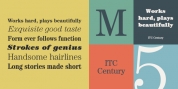
Katana is 21st-century script typeface that thrives with energy. Its stylised letterforms feature a strong slant: about 40°, or more than twice the amount of slant found in a typical italic font. Katana's angularity expresses an aura that combines the small refined details of calligraphy with the vibrancy of large-format graffiti lettering. Unusual for a script typeface, Katana has multiple weights available; there are five in the family, and they range from Light through Bold. As one shuffles from each weight to the next, the level of stroke contrast increases. While Katana's Light weight is monolinear, the Bold weight has extremely hight contrast between its thick and thin strokes, which dials up the font's dynamic-feeling even more. The heavier weights clearly look like their letterforms have been written with broad pens or brushes, and the heaviest font looks like a techno-style design crossed with the work of a traditional sign-painter. Each member of the Katana family has lining figures as its font's default numeral style, but there are also oldstyle figures available through an OpenType feature. Plus, each font includes about 26 alternate glyphs, substituted into the text whenever the 'contextual alternates' feature is active. Katana is a great addition to an editorial designer's toolkit. It comes from Parimal Parmar, a designer in Ahmedabad/India.